





Introduction
Most drivers nowadays are quite familiar with all the indicators on their car dashboard. In more detail, each indicator is a part of an information signal that constantly works to monitor the car’s health status, which can be diagnosed through an OBD system.
What is OBD?
On-Board Diagnostic (OBD) is one of a feature that you may find in your car to help track your vehicle performance. OBD-II, the correct name to be exact, itself is a standard port that has been established in the 90s, applied by many automotive manufacturers nowadays. The feature was installed in the car as a standardized port plug-and-play to allow the driver to tap all signal readings from the vehicle sensor by using a scanner.
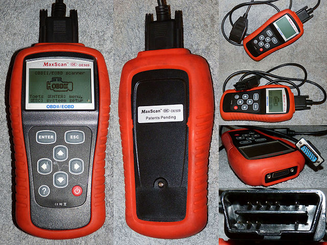
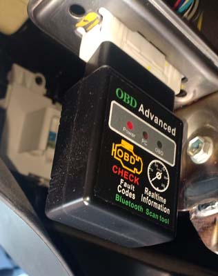
In the past, we can only get all sensor readings if we sent our car to the workshop as it needs an adapter with a signal processing unit before we can diagnose. Nowadays, this feature is way more convenient as there is a DIY version of the OBD scanner using a blue tooth connection that allows us to link onto our mobile phone. Once you have the adapter → plug-and-play scanner onto the port → download the app on your phone → with some app settings, and you can get a real-time reading.
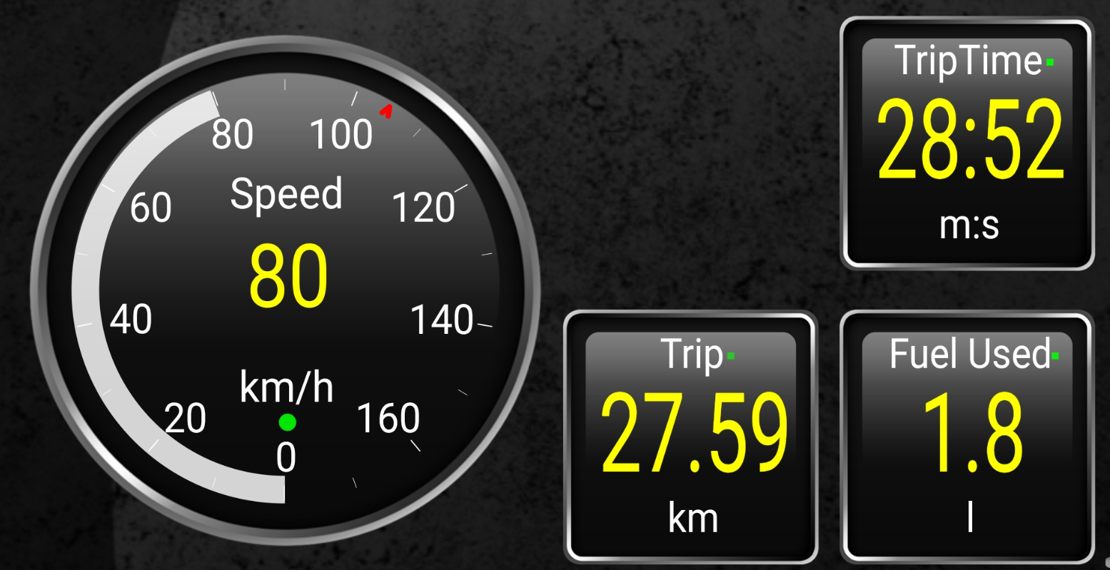
The above screenshot is digital dashboards customized from the app designed to fit driver use. It shows odometer reading, how long the car has been travelled measured in seconds, how far the travel has been in km, and how much petrol used for this particular trip measured in litres. There are a lot of other sensor readings that we can select and arrange the user interface subject to our needs. Another thing to mention, we also can log the reading and pull out our trip data in CSV format.
Exploratory Data Analysis of OBD Data
The data was taken from one of the recent trips that I logged using an OBD scanner to showcase what we can get out of OBD monitoring.
Let’s get started with importing the necessary module, pandas and plotly. In this demonstration, we are going to create a subplot of plotly figures to embed all our observations.
import pandas as pd
import plotly.graph_objects as go
from plotly.subplots import make_subplots
We continue with reading the CSV data taken out of the OBD log. In typical EDA activity, we need to see what’s inside the data to get more understanding of how we want to explore further before getting any valuable insight.
# Add parameter index_col=[‘ Device Time’] if we want to set device time as an index earlier.
df = pd.read_csv(‘trackLog.csv’,parse_dates=[‘ Device Time’])
# Check df with df.info()
df.info()
Once we dive into the data, we will see the data set consists of 2662 rows x 179 columns with a lot of ‘-‘ instead of ‘0’. This is something that we don’t expect as the ‘-‘ majority indicates no value on the data itself, the same as ‘0’. Hence, we need to replace all ‘-‘ with zeros for easier data processing.
# The df consist of 2662 row x 179 column and it contains a lot ‘-’
# Replace all ‘-’ in table with 0
df = df.replace({‘-’:0})
Next observation, there are several columns with all zero values among the whole 179 columns. Using the below line, we notice there is 81 columns with zero value that we can safely remove as it doesn’t give any beneficial information, which leaves us 98 data column remaining.
Note: 179 columns that we see in the raw data set came as a result of the OBD app setting. All parameter was purposely selected to show the whole information that we can get from the OBD scanner. Given that we are interested to observe a few parameters, these columns can be reduced to suit our needs.
# Since we saw data contain a lot of ‘0’, we would like to know if there is any column that contain ONLY ‘0’
# Use the code without len() if we want to know the column name with all ‘0’
len(df.loc[:, (df == 0).all(axis=0)].columns)
# Drop all columns that contain ONLY ‘0’
dfdrop = df.loc[:, (df == 0).all(axis=0)].columns
df.drop(dfdrop, axis=1, inplace=True)
# Check columns
len(df.columns)
Plot the Graph
Once we have done with data cleaning, we are ready to visualize it using plotly. In this case, I have selected a few parameters to be observed in the 2×2 subplot graph arrangement and dual-axis on each subplot.
# Create figure with secondary y-axis and 2x2 subplot
fig = make_subplots(rows=2, cols=2, start_cell=”bottom-left”,
                    specs=[[{“secondary_y”: True}, {“secondary_y”: True}],
                          [{“secondary_y”: True}, {“secondary_y”: True}]])
Few columns that I have selected to plot using fig.add_trace():
- ‘Speed
(OBD) (km/h)’ vs ‘Trip time(whilst stationary)(s)’ in row =
1, col = 1 - ‘Speed
(OBD) (km/h)’ vs ‘Percentage of City driving(%)’ and ‘Percentage
of Highway driving(%)’ in row = 1, col = 2 - ‘Trip
Distance(km)’ vs ‘Fuel used (trip)(l)’ in row =
2, col = 1 - ‘Speed
(OBD)(km/h)’ vs ‘Engine Coolant Temperature(°C)’ and ‘Intake
Air Temperature(°C)’ in row = 2, col = 2
fig.add_trace(go.Scatter(x = df.index,y=df[‘Speed (OBD)(km/h)’].astype(‘float’), name = “Speed (OBD)(km/h)”), secondary_y=False, row=1, col=1)
fig.add_trace(go.Scatter(x = df.index,y=df[‘Trip time(whilst stationary)(s)’].astype(‘float’),name = “Trip time(whilst stationary)[s]”), secondary_y=True, row=1, col=1)
fig.add_trace(go.Scatter(x = df.index,y=df[‘Speed (OBD)(km/h)’].astype(‘float’), name = “Speed (OBD)(km/h)”), secondary_y=False, row=1, col=2)
fig.add_trace(go.Scatter(x = df.index,y=df[‘Percentage of City driving(%)’].astype(‘float’),name = “Percentage of City driving(%)”), secondary_y=True, row=1, col=2)
fig.add_trace(go.Scatter(x = df.index,y=df[‘Percentage of Highway driving(%)’].astype(‘float’),name = “Percentage of Highway driving(%)”), secondary_y=True, row=1, col=2)
fig.add_trace(go.Scatter(x = df.index,y=df[‘Trip Distance(km)’].astype(‘float’), name = “Trip Distance(km)”), secondary_y=False, row=2, col=1)
fig.add_trace(go.Scatter(x = df.index,y=df[‘Fuel used (trip)(l)’].astype(‘float’),name = “Fuel used (trip)(l)”), secondary_y=True, row=2, col=1)
fig.add_trace(go.Scatter(x = df.index,y=df[‘Speed (OBD)(km/h)’].astype(‘float’), name = “Speed (OBD)(km/h)”), secondary_y=False, row=2, col=2)
fig.add_trace(go.Scatter(x = df.index,y=df[‘Engine Coolant Temperature(°C)’].astype(‘float’),name = “Engine Coolant Temperature(°C)”), secondary_y=True, row=2, col=2)
fig.add_trace(go.Scatter(x = df.index,y=df[‘Intake Air Temperature(°C)’].astype(‘float’),name = “Intake Air Temperature(°C)”), secondary_y=True, row=2, col=2)
For more visibility, we can update the color of each y-axis following the graph color that has been preset and adjusts the y-axis limit using fig.update_layout(). Please note that all data types above are set astype(float)since the original data was an object.
fig.update_layout(xaxis_title=”Time”,
                  xaxis2_title=”Time”,
                  yaxis = dict(title=”Speed [km/h]”,
                  titlefont=dict(color=”blue”),
                  tickfont=dict(color=”blue”)),
                  yaxis2 = dict(title=”Trip time [s]”,
                  titlefont=dict(color=”red”),
                  tickfont=dict(color=”red”)),
                  yaxis3 = dict(title=”Speed [km/h]”,
                  titlefont=dict(color=”mediumaquamarine”),
                  tickfont=dict(color=”mediumaquamarine”)),
                  yaxis4 = dict(title=”Driving behavior [%]”,
                  titlefont=dict(color=”mediumorchid”),
                  tickfont=dict(color=”mediumorchid”)),
                  yaxis5 = dict(title=”Trip distance [km]”,
                  titlefont=dict(color=”dodgerblue”),
                  tickfont=dict(color=”dodgerblue”)),
                  yaxis6 = dict(title=”Fuel used [l]”,
                  titlefont=dict(color=”magenta”),
                  tickfont=dict(color=”magenta”)),
                  yaxis7 = dict(title=”Speed [km/h]”,
                  titlefont=dict(color=”chartreuse”),
                  tickfont=dict(color=”chartreuse”)),
                  yaxis8 = dict(title=”Temperature [°C]”,
                  titlefont=dict(color=”hotpink”),
                  tickfont=dict(color=”hotpink”)),
                  yaxis_range=[0,150],
                  yaxis2_range=[0,300],
                  yaxis3_range=[0,150],
                  yaxis4_range=[0,100],
                  yaxis5_range=[0,50],
                  yaxis6_range=[0,5],
                  yaxis7_range=[0,150],
                  yaxis8_range=[0,100]
                 )
fig.show()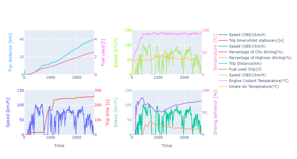
Subplot 1:'Speed (OBD) (km/h)'vs'Trip time(whilst stationary)(s)'
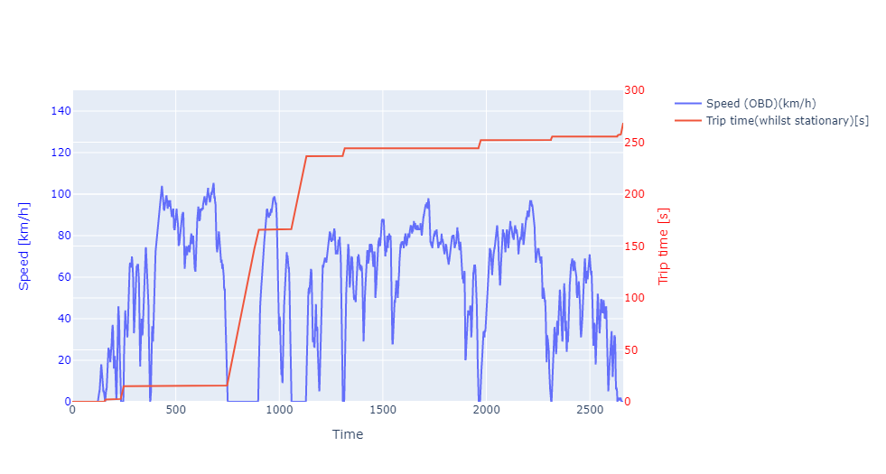
The first graph is a plot ‘Speed (OBD) (km/h)’ vs ‘Trip time (whilst stationary)(s)’. Speed reading is quite self-explanatory. We can see the trip lasts for 2661 seconds or 44 minutes trip time. There’s some occasion where the speed was purposely slowed down or even stop, ie. traffic light, and it counts for 268 seconds. Quite a smooth trip as it only ~10% of the trip time spent during stationary period.
Subplot 2:'Speed (OBD) (km/h)'vs'Percentage of City driving(%)'and‘Percentage of Highway driving(%)’
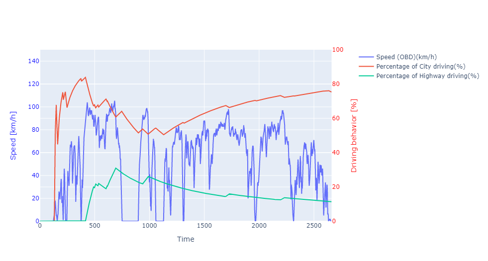
The second graph is a plot ‘Speed (OBD) (km/h)’ vs ‘Percentage of City driving(%)’ and ‘Percentage of Highway driving(%)’. The percentage of city driving and highway driving are opposite each other. The car was having an ‘eco drive’ light on the dashboard as an indication of driving behavior. Basically, this feature is a speed limiter for conscious driving with a speed of less than 100 km/h. When the speed is 100 km/h. The graph tells us that 80% of driving behavior is city-style driving (speed 100 km/h).
Subplot-3:‘Trip Distance(km)’vs‘Fuel used (trip)(l)’
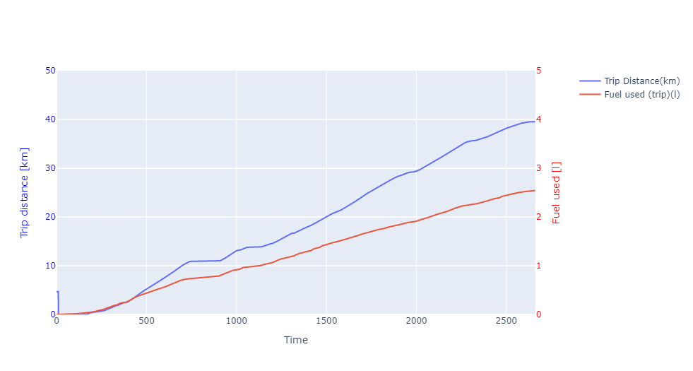
The third graph is a plot ‘Trip Distance(km)’ vs ‘Fuel used (trip)(l)’. The trip distance is close to 40 km utilizing 2.5-litre gasoline fuel. We can get the fuel efficiency of around 16 km/liter, pretty good for typical city-type cars.
Subplot-4:‘Speed (OBD)(km/h)’vs‘Engine Coolant Temperature(°C)’and‘Intake Air Temperature(°C)’
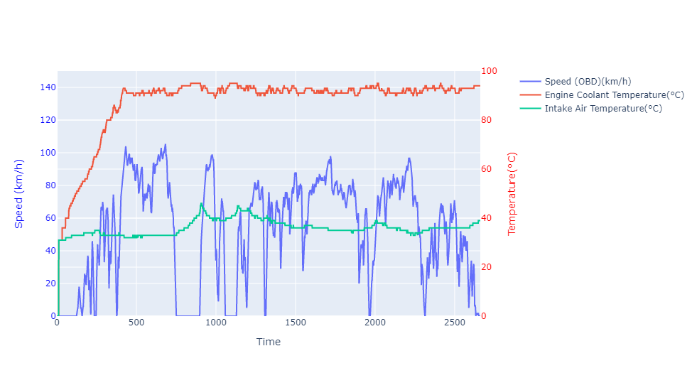
The fourth graph is ‘Speed (OBD)(km/h)’ vs ‘Engine Coolant Temperature(°C)’ and ‘Intake Air Temperature(°C)’. We can see that it takes around 400 seconds (~6 minutes) to warm the engine coolant temperature to reach the stable temperature at ~93°C while the intake Air temperature was easily get stabilized. This graph also reminds our general recommendation to let the car idle for a few minutes once the engine started. Typically, we can also see the indication of a coolant symbol in the Odometer with blue light that turns off once the warm-up process is done, which means the coolant reaches a stable temperature and the engine are ready to operate.
Bonus: Plot the Trip Using Folium
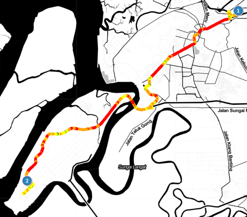
Other than the vehicle performance data observed, there are GPS coordinates recorded as well using an ODB scanner. By having this information, we can plot the data into a map using folium module for better visualization of the trip similar to a speed heatmap.
import folium
import branca.colormap as cm
We will use folium, the module to visualize the trip. Another module branca.colormap needs to be added for mapping the speed color that will cover in the next few lines of code.
# Create the base map and set the map color as in ‘Stamen Toner’
MY_COORD = (3.065024, 101.481842)
map = folium.Map(location=MY_COORD, tiles=’Stamen Toner’, zoom_start=12)
For this map, we are using ‘Stamen Toner’ map tiles. There are various map tiles provided in folium ready to select. You may refer to folium documentation or here.
# Filter only necessary data and set data frame
dff = df[[‘ Latitude’,’ Longitude’,’Speed (OBD)(km/h)’]].astype(float)
# Find limit for color mapping
min_speed=dff[‘Speed (OBD)(km/h)’].min()
max_speed=dff[‘Speed (OBD)(km/h)’].max()
dff[‘Speed (OBD)(km/h)’].describe().to_frame()
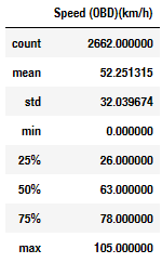
Once we filter the necessary data from the main data frame df, we need to generate some descriptive statistic values to find out the limit for the color map setting. Only then we are ready to map the speed color based on the limit from the descriptive statistic value.
# Setup color map
colormap = cm.StepColormap(colors=[‘green’,’yellow’,’orange’,’red’],
                           index=[min_speed,26,63,78,max_speed],
                           vmin= min_speed,
                           vmax=max_speed)
The next line is the looping process to map all GPS coordinate data using folium.CircleMarker() combined with colormap that we have set. Additional icons can be added to denote the start and finish points using folium.features.CustomIcon() added to the map to denote start (1) and finish (2) locations.
# Apply circle marker on each row of GPS location with color map assigned for lat, lon, color in zip(dff[‘ Latitude’],dff[‘ Longitude’],dff[‘Speed (OBD)(km/h)’]):
 folium.CircleMarker(location=[lat,lon],
 radius = 2,
 fill = True,
 color = colormap(color)).add_to(map)
# Add icon for (start) and (finish). For more custom icon, you may find it here.
start = [3.065024, 101.481842]
icon1 = folium.features.CustomIcon(‘https://img.icons8.com/stickers/100/000000/1-circle-c.png', icon_size=(30,30))
folium.Marker(location=start,icon=icon1).add_to(map)
finish = [2.914668, 101.294390]
icon2 = folium.features.CustomIcon(‘https://img.icons8.com/stickers/100/000000/2-circle-c.png', icon_size=(30, 30))
folium.Marker(location=finish,icon=icon2).add_to(map)
We are ready to have a look at the map with the speed route mapped in color.
map
# Save map in html
map.save(‘obd_trip.html’)
Conclusion
In this article, we have covered the EDA activity of raw data taken from the OBD scanner using the python module pandas, plotly, and folium. Few insights we can get from the chart like:
- How much time is spent during a stationary period (idle)?
- How the car speed affects driving behavior, car fuel efficiency?
- How much time is recommended for the car to be in idle mode once the engine started?
By having a GPS coordinate record, we can also plot our trip on the map with a speed heatmap color. Anyway, thanks for reading. Feel free to fork and tweak the code in this Github repo if you find it useful.


