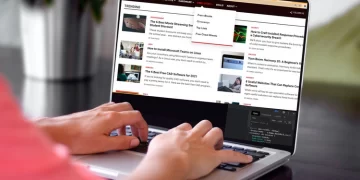





Building a responsive navigation bar is an essential part of improving your user experience and web design skills. In this article, we’ll show you how to make a responsive navigation bar using only HTML and CSS (not even a single line of JavaScript!).
So, if you’re a beginner who’s learning front-end development and looking to build a navigation bar, you’ve arrived at the right place. But, before we show you how to create a navigation bar with HTML and CSS, let’s first understand the basic design principles of a responsive navigation bar.
Prerequisites: The Three Key Elements of a Navbar
It’s quite obvious that most website owners want to acquire new visitors. The first step towards doing so is showing the visitors a clear and concise path. You’re supposed to build a navbar that inspires curiosity and attracts visitors simultaneously. You should have three key elements while designing an ideal navbar:
Simple
It should be clear and easy to read. Instead of cluttering the navbar with links to every page, you should go for the broader categories of your site. Afterward, you can add sub-menus in the form of a dropdown if necessary.
Noticeable
A simple navbar shouldn’t be boring at all. You should stick to a pre-decided brand color to make the design more consistent. You can experiment with numerous color schemes and use lighter or darker shades for highlighting and dropdown menus.
Responsive
A global internet usage report by Statista shows that 59.5 percent of the global population is actively using the internet, and 92.6 percent are using it via mobile devices. That’s more than enough to understand the importance of implementing responsive mobile navigation on your site.
Top-level mobile navigation is quite popular. You can use a hamburger menu, guillotine, floating icons, and tabs. It’s a savior when you have five or more categories with multiple hierarchies. Top-level navigation can save significant screen space, especially when you have a content-heavy site.
Tab bars with relevant icons are a perfect fit for the bottom navigation bar as they usually contain three to five menus at the same level of hierarchy. Submenus and sequential menus follow the main category with the parent-child relationship.
Building a Responsive Navigation Bar With Hamburger Menu
Now that the design principles are crystal clear in your mind, let’s start building the menu. There are a variety of CSS features for building responsive websites. However, in this article, you’re going to learn to create a responsive navigation menu with CSS Flexbox and Media Queries from scratch.
So, what will your navbar look like? It’ll have top-level navigation with:
- Logo
- Navigation Menus
- Dropdown Menu
- Hamburger Menu (using the checkbox hack)
Getting Started With HTML
<!DOCTYPE html>
<html lang="en">
<head>
<meta charset="UTF-8" />
<meta http-equiv="X-UA-Compatible" content="IE=edge" />
<meta name="viewport" content="width=device-width, initial-scale=1.0" />
<link rel="stylesheet" href="style.css" />
<title>Document</title>
</head>
<body>
<nav class="navbar">
<!-- LOGO -->
<div class="logo">MUO</div>
<!-- NAVIGATION MENU -->
<ul class="nav-links">
<!-- USING CHECKBOX HACK -->
<input type="checkbox" id="checkbox_toggle" />
<label for="checkbox_toggle" class="hamburger">☰</label>
<!-- NAVIGATION MENUS -->
<div class="menu">
<li><a href="/">Home</a></li>
<li><a href="/">About</a></li>
<li class="services">
<a href="/">Services</a>
<!-- DROPDOWN MENU -->
<ul class="dropdown">
<li><a href="/">Dropdown 1 </a></li>
<li><a href="/">Dropdown 2</a></li>
<li><a href="/">Dropdown 2</a></li>
<li><a href="/">Dropdown 3</a></li>
<li><a href="/">Dropdown 4</a></li>
</ul>
</li>
<li><a href="/">Pricing</a></li>
<li><a href="/">Contact</a></li>
</div>
</ul>
</nav>
</body>
</html>
You’ll have the dropdown menu inside the Service (main) menu. We can skip the hamburger menu while building the desktop navbar. After all, we haven’t yet discussed the checkbox workflow. Your HTML navbar structure is now complete.
Output:

Applying Basic CSS: Utilities
/* UTILITIES */
* {
 margin: 0;
 padding: 0;
 box-sizing: border-box;
}
body {
 font-family: cursive;
}
a {
 text-decoration: none;
}
li {
 list-style: none;
}
Moving forward, let’s style the HTML navbar.
Styling the Navbar Using CSS Flexbox
We’ll be using CSS Flexbox and applying hover effects for highlighting. The Service menu needs a little bit of extra attention as you have to set display: none; for normal conditions and set it to display: block; when someone hovers on it.
/* NAVBAR STYLING STARTS */
.navbar {
 display: flex;
 align-items: center;
 justify-content: space-between;
 padding: 20px;
 background-color: teal;
 color: #fff;
}
.nav-links a {
 color: #fff;
}
/* LOGO */
.logo {
 font-size: 32px;
}
/* NAVBAR MENU */
.menu {
 display: flex;
 gap: 1em;
 font-size: 18px;
}
.menu li:hover {
 background-color: #4c9e9e;
 border-radius: 5px;
 transition: 0.3s ease;
}
.menu li {
 padding: 5px 14px;
}
/* DROPDOWN MENU */
.services {
 position: relative;
}
.dropdown {
 background-color: rgb(1, 139, 139);
 padding: 1em 0;
 position: absolute; /*WITH RESPECT TO PARENT*/
 display: none;
 border-radius: 8px;
 top: 35px;
}
.dropdown li + li {
 margin-top: 10px;
}
.dropdown li {
 padding: 0.5em 1em;
 width: 8em;
 text-align: center;
}
.dropdown li:hover {
 background-color: #4c9e9e;
}
.services:hover .dropdown {
 display: block;
}Output:

Responsive Navbar Using CSS Media Queries
As we mentioned earlier, you’ll have a hamburger menu that will show up only on mobile devices with small screen sizes. For this, you’ll have two children of <ul class=”nav-links”>. Firstly, you’ll use input type=”checkbox” and give the label a class=”hamburger”. Second, give your navigation menu class=”menu”.
Note that ☰ is an HTML entity that displays the ☰ (hamburger icon.)
<body>
<nav class="navbar">
<!-- LOGO -->
<div class="logo">MUO</div>
<!-- NAVIGATION MENU -->
<ul class="nav-links">
<!-- USING CHECKBOX HACK -->
<input type="checkbox" id="checkbox_toggle" />
<label for="checkbox_toggle" class="hamburger">☰</label>
<!-- NAVIGATION MENUS -->
<div class=”menu”>...</div>
</ul>
</nav>
</body>
The logic behind using the checkbox element is that when it’s unchecked it’ll have display: none; whereas while checked it’ll change the CSS property of the general sibling selector (~) by setting it to display: block; Simply stated, you’re using the checkbox for toggling the hamburger and the navigation menus between the expanded and hidden states.
Style the navbar for mobile devices using CSS media queries as shown below. In this case, you can also use CSS grid and JS for the mobile menu.
/*RESPONSIVE NAVBAR MENU STARTS*/
/* CHECKBOX HACK */
input[type=checkbox]{
 display: none;
}
/*HAMBURGER MENU*/
.hamburger {
 display: none;
 font-size: 24px;
 user-select: none;
}
/* APPLYING MEDIA QUERIES */
@media (max-width: 768px) {
.menu {
 display:none;
 position: absolute;
 background-color:teal;
 right: 0;
 left: 0;
 text-align: center;
 padding: 16px 0;
}
.menu li:hover {
 display: inline-block;
 background-color:#4c9e9e;
 transition: 0.3s ease;
}
.menu li + li {
 margin-top: 12px;
}
input[type=checkbox]:checked ~ .menu{
 display: block;
}
.hamburger {
 display: block;
}
.dropdown {
 left: 50%;
 top: 30px;
 transform: translateX(35%);
}
.dropdown li:hover {
 background-color: #4c9e9e;
}
}
Here’s what we built:
Desktop

Mobile devices

Experimenting Is the Best Way to Design Your Ideal Navigation Bar
Having good website navigation heavily impacts bounce rates and conversion rates. Essentially, the first fold of your website should have a clear context, hierarchical navigation, and a call-to-action. Your website navigation structure should help visitors land on the popular or trending pages of your site in three clicks or less. So, keep on experimenting and designing a better site navigation!


