

Overview
In this article, we will be closely working with the heart disease prediction and for that, we will be looking into the heart disease dataset from that dataset we will derive various insights that help us know the weightage of each feature and how they are interrelated to each other but this time our sole aim is to detect the probability of person that will be affected by a savior heart problem or not.
Takeaways
The Heart Disease prediction will have the following key takeaways:
- Data insight: As mentioned here we will be working with the heart disease detection dataset and we will be putting out interesting inferences from the data to derive some meaningful results.
- EDA: Exploratory data analysis is the key step for getting meaningful results.
- Feature engineering: After getting the insights from the data we have to alter the features so that they can move forward for the model building phase.
- Model building: In this phase, we will be building our Machine learning model for heart disease detection.
So let’s get started!
Importing Necessary Libraries
Plotting Libraries
import pandas as pd
import numpy as np
import matplotlib.pyplot as plt
import seaborn as sns
import cufflinks as cf
%matplotlib inline
Metrics for Classification technique
from sklearn.metrics import classification_report,confusion_matrix,accuracy_score
Scaler
from sklearn.preprocessing import StandardScaler
from sklearn.model_selection import  RandomizedSearchCV, train_test_split
Model building
from xgboost import XGBClassifier
from catboost import CatBoostClassifier
from sklearn.ensemble import RandomForestClassifier
from sklearn.neighbors import KNeighborsClassifier
from sklearn.svm import SVC
Data Loading
Here we will be using the pandas read_csv function to read the dataset. Specify the location of the dataset and import them.
Importing Data
data = pd.read_csv("heart.csv")
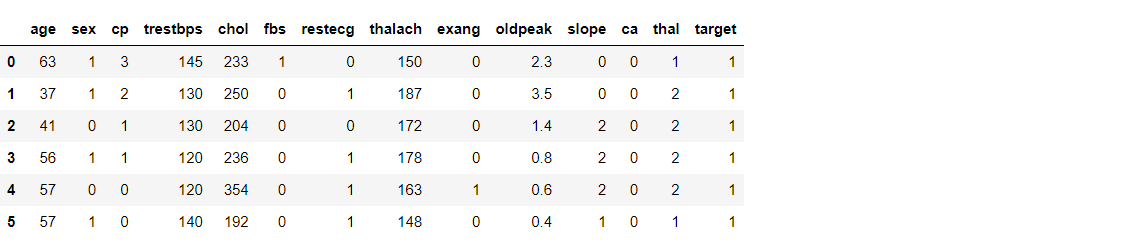
data.head(6) # Mention no of rows to be displayed from the top in the argument
Output:

Exploratory Data Analysis
Now, let’s see the size of the dataset
data.shape
Output:
(303, 14)
Inference: We have a dataset with 303 rows which indicates a smaller set of data.
As above we saw the size of our dataset now let’s see the type of each feature that our dataset holds.
data.info()
Output:
RangeIndex: 303 entries, 0 to 302
Data columns (total 14 columns):
 #   Column    Non-Null Count  Dtype
---  ------    --------------  -----
 0   age       303 non-null    int64
 1   sex       303 non-null    int64
 2   cp        303 non-null    int64
 3   trestbps  303 non-null    int64
 4   chol      303 non-null    int64
 5   fbs       303 non-null    int64
 6   restecg   303 non-null    int64
 7   thalach   303 non-null    int64
 8   exang     303 non-null    int64
 9   oldpeak   303 non-null    float64
 10  slope     303 non-null    int64
 11  ca        303 non-null    int64
 12  thal      303 non-null    int64
 13  target    303 non-null    int64
dtypes: float64(1), int64(13)
memory usage: 33.3 KB
Inference: The inference we can derive from the above output is:
- Out of 14 features, we have 13 int types and only one with the float data types.
- Woah! Fortunately, this dataset doesn’t hold any missing values.
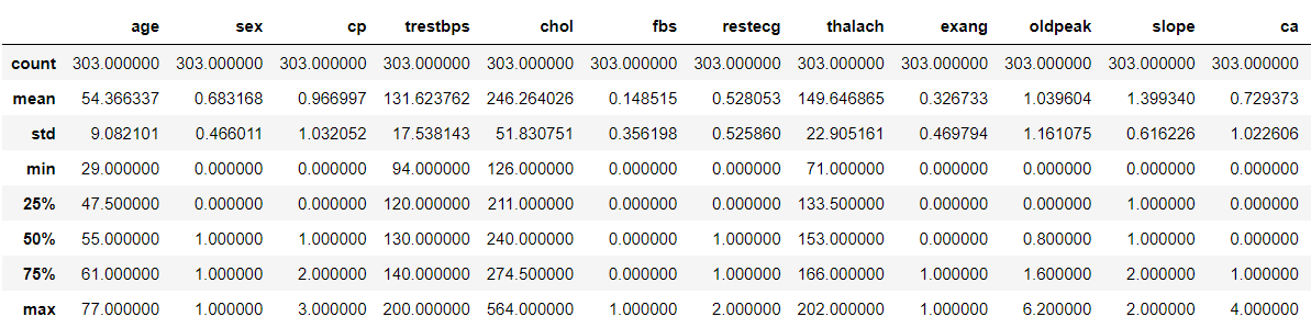
As we are getting some information from each feature so let’s see how statistically the dataset is spread.
data.describe()
Output:

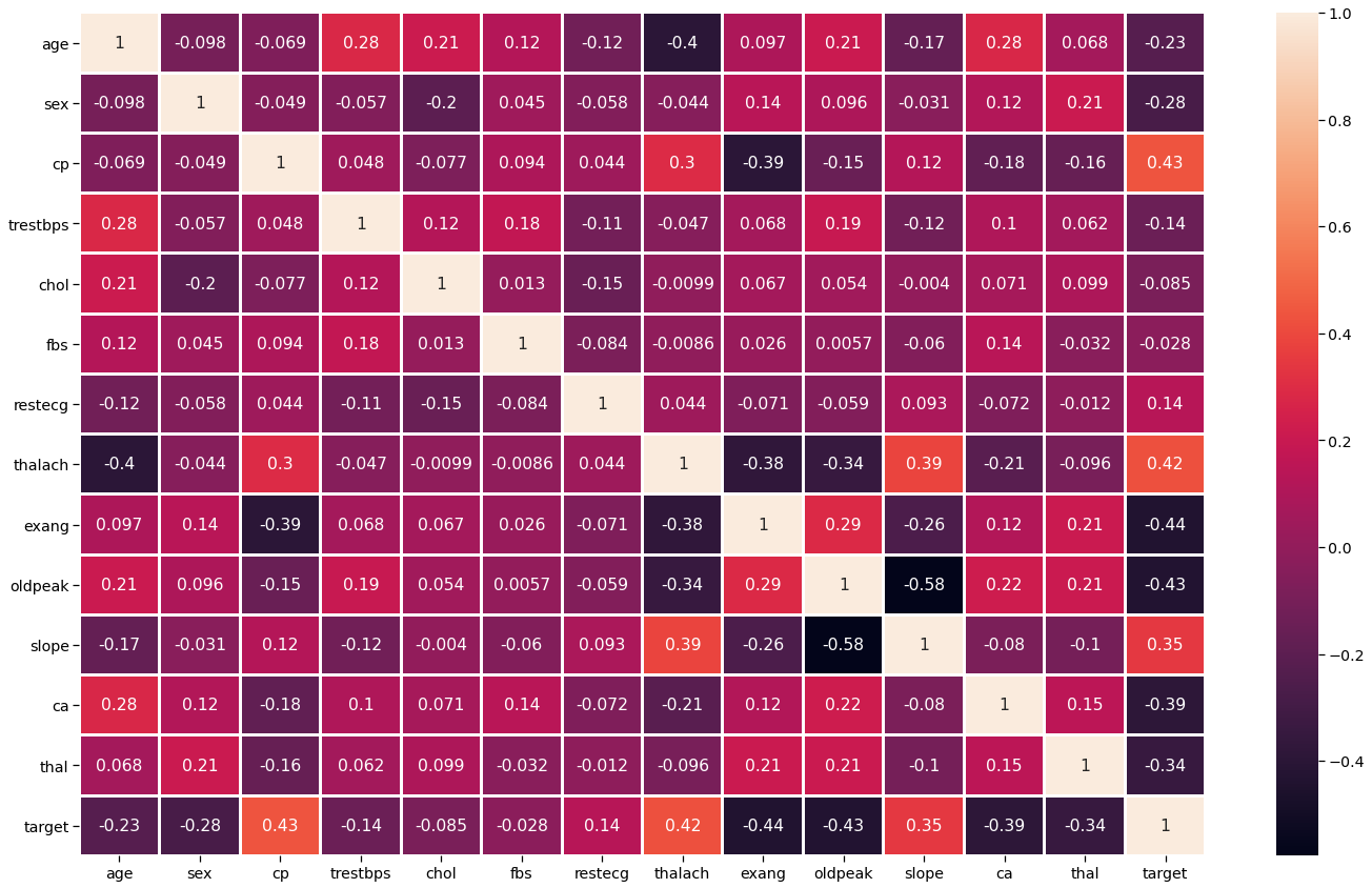
It is always better to check the correlation between the features so that we can analyze that which feature is negatively correlated and which is positively correlated so, Let’s check the correlation between various features.
plt.figure(figsize=(20,12))
sns.set_context('notebook',font_scale = 1.3)
sns.heatmap(data.corr(),annot=True,linewidth =2)
plt.tight_layout()
Output:

By far we have checked the correlation between the features but it is also a good practice to check the correlation of the target variable.
So, let’s do this!
sns.set_context('notebook',font_scale = 2.3)
data.drop('target', axis=1).corrwith(data.target).plot(kind='bar', grid=True, figsize=(20, 10),
                                                        title="Correlation with the target feature")
plt.tight_layout()
Output:

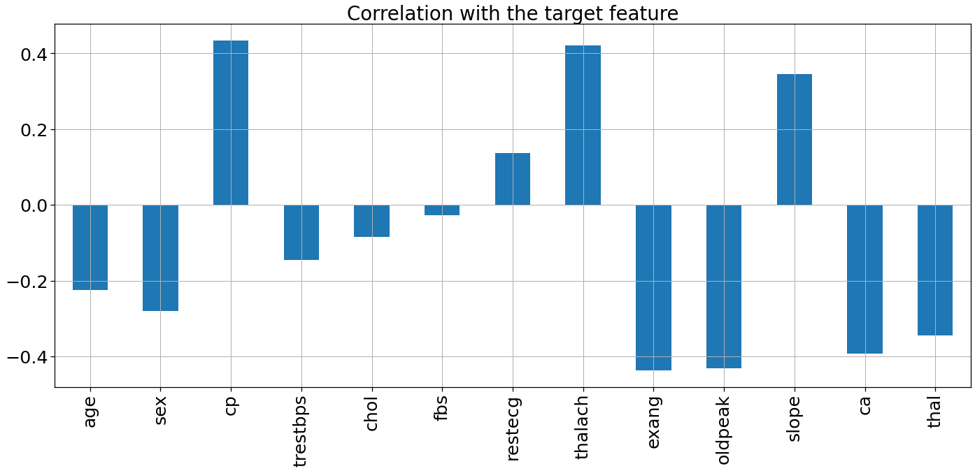
Inference: Insights from the above graph are:
- Four feature( “cp”, “restecg”, “thalach”, “slope” ) are positively correlated with the target feature.
- Other features are negatively correlated with the target feature.
So, we have done enough collective analysis now let’s go for the analysis of the individual features which comprises both univariate and bivariate analysis.
Age(“age”) Analysis
Here we will be checking the 10 ages and their counts.
plt.figure(figsize=(25,12))
sns.set_context('notebook',font_scale = 1.5)
sns.barplot(x=data.age.value_counts()[:10].index,y=data.age.value_counts()[:10].values)
plt.tight_layout()
Output:

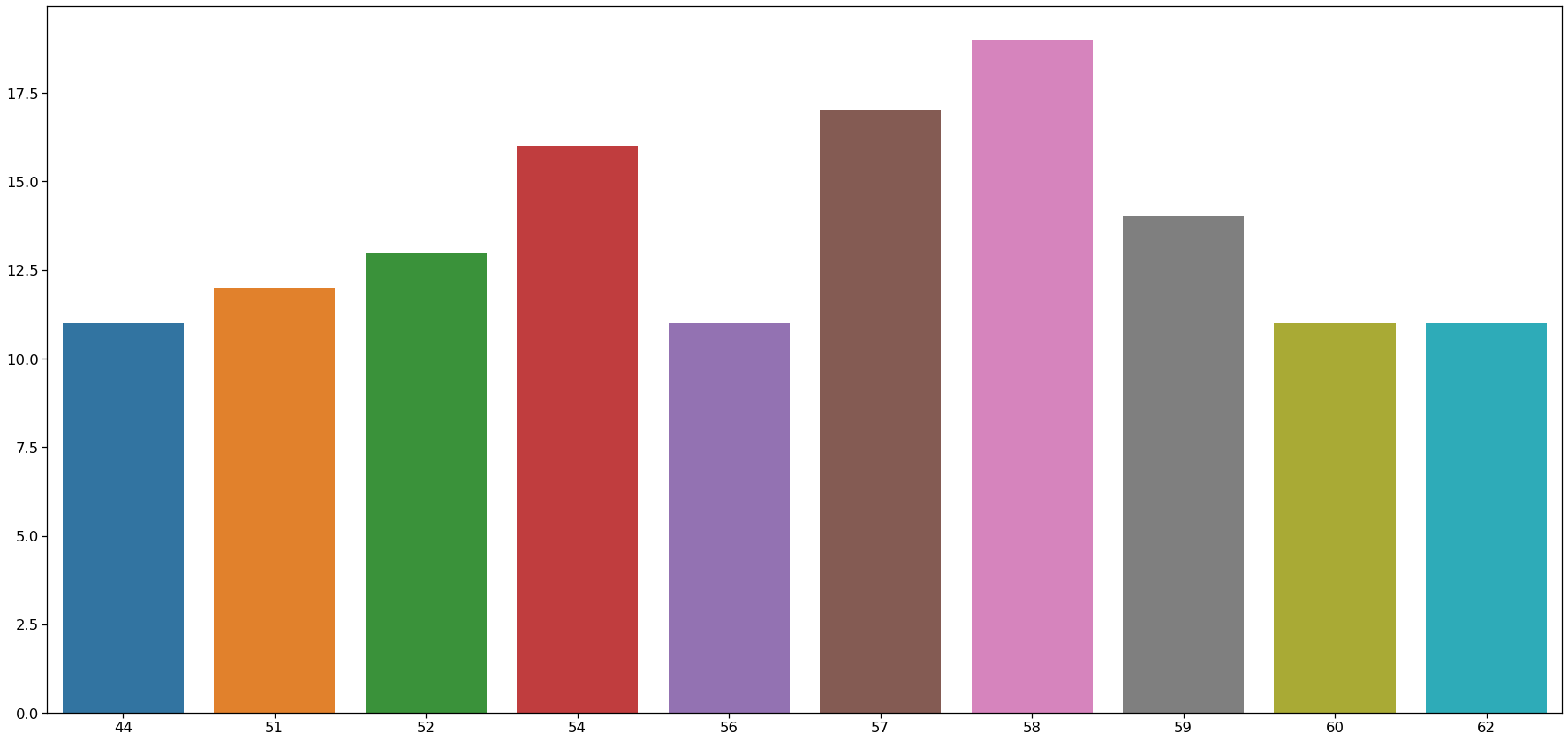
Inference: Here we can see that the 58 age column has the highest frequency.
Let’s check the range of age in the dataset.
minAge=min(data.age)
maxAge=max(data.age)
meanAge=data.age.mean()
print('Min Age :',minAge)
print('Max Age :',maxAge)
print('Mean Age :',meanAge)
Output:
Min Age : 29 Max Age : 77 Mean Age : 54.366336633663366
We should divide the Age feature into three parts – “Young”, “Middle” and “Elder”
Young = data[(data.age>=29)&(data.age<40)]
Middle = data[(data.age>=40)&(data.age<55)]
Elder = data[(data.age>55)]

plt.figure(figsize=(23,10))
sns.set_context('notebook',font_scale = 1.5)
sns.barplot(x=['young ages','middle ages','elderly ages'],y=[len(Young),len(Middle),len(Elder)])
plt.tight_layout()
Output:

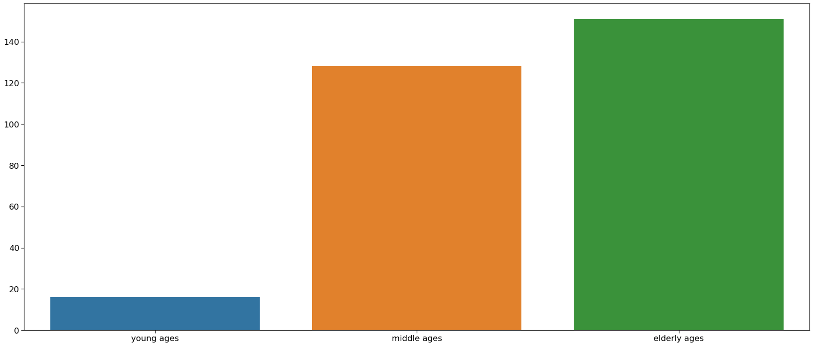
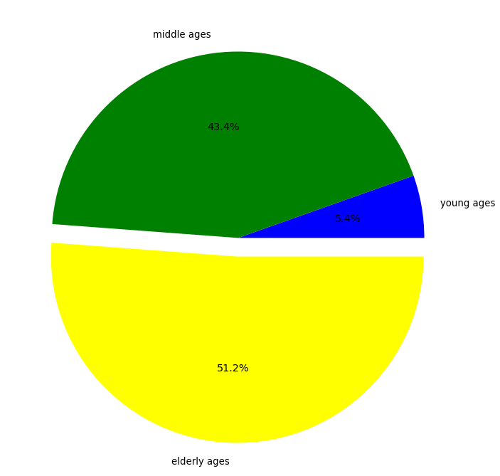
Inference: Here we can see that elder people are the most affected by heart disease and young ones are the least affected.
To prove the above inference we will plot the pie chart.
colors = ['blue','green','yellow']
explode = [0,0,0.1]
plt.figure(figsize=(10,10))
sns.set_context('notebook',font_scale = 1.2)
plt.pie([len(Young),len(Middle),len(Elder)],labels=['young ages','middle ages','elderly ages'],explode=explode,colors=colors, autopct='%1.1f%%')
plt.tight_layout()
Output:

Sex(“sex”) Feature Analysis
plt.figure(figsize=(18,9))
sns.set_context('notebook',font_scale = 1.5)
sns.countplot(data['sex'])
plt.tight_layout()
Output:

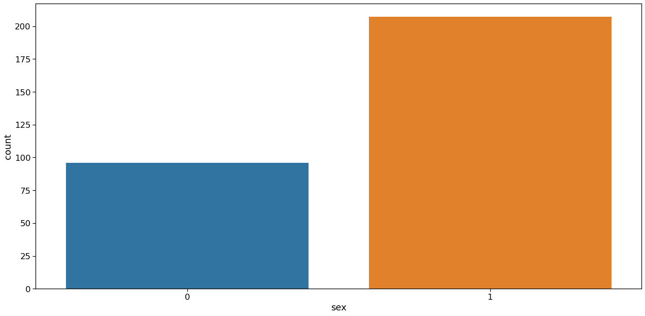
Inference: Here it is clearly visible that, Ratio of Male to Female is approx 2:1.
Now let’s plot the relation between sex and slope.
plt.figure(figsize=(18,9))
sns.set_context('notebook',font_scale = 1.5)
sns.countplot(data['sex'],hue=data["slope"])
plt.tight_layout()
Output:

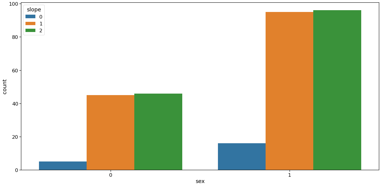
Inference: Here it is clearly visible that the slope value is higher in the case of males(1).
Chest Pain Type(“cp”) Analysis
plt.figure(figsize=(18,9))
sns.set_context('notebook',font_scale = 1.5)
sns.countplot(data['cp'])
plt.tight_layout()
Output:
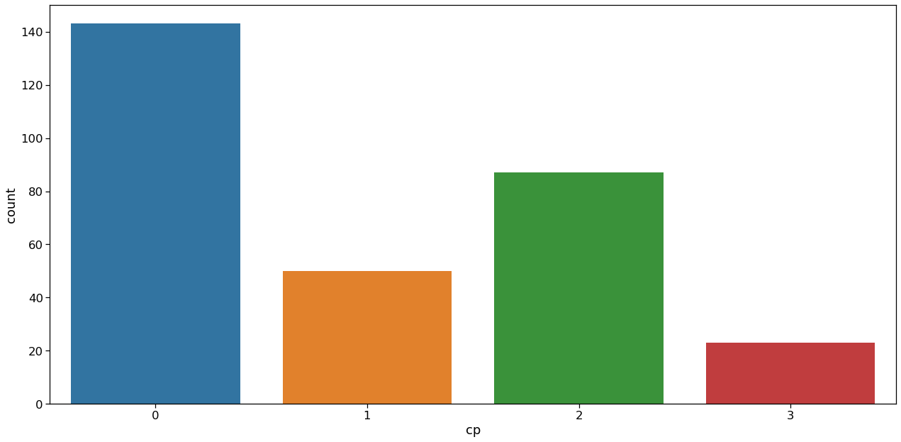
Inference: As seen, there are 4 types of chest pain
- status at least
- condition slightly distressed
- condition medium problem
- condition too bad
Analyzing cp vs target column
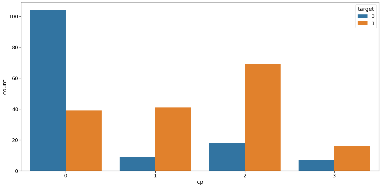
Inference: From the above graph we can make some inferences,
- People having the least chest pain are not likely to have heart disease.
- People having severe chest pain are likely to have heart disease.
Elderly people are more likely to have chest pain.
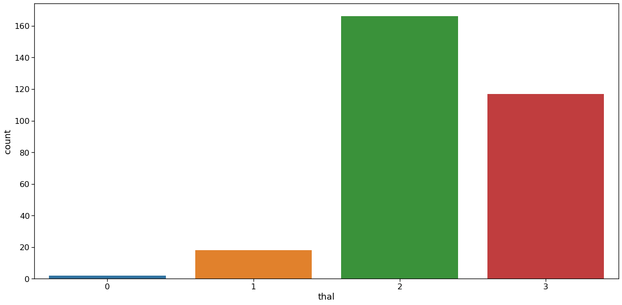
Thal Analysis
plt.figure(figsize=(18,9))
sns.set_context('notebook',font_scale = 1.5)
sns.countplot(data['thal'])
plt.tight_layout()
Output:
Target
plt.figure(figsize=(18,9))
sns.set_context('notebook',font_scale = 1.5)
sns.countplot(data['target'])
plt.tight_layout()
Output:
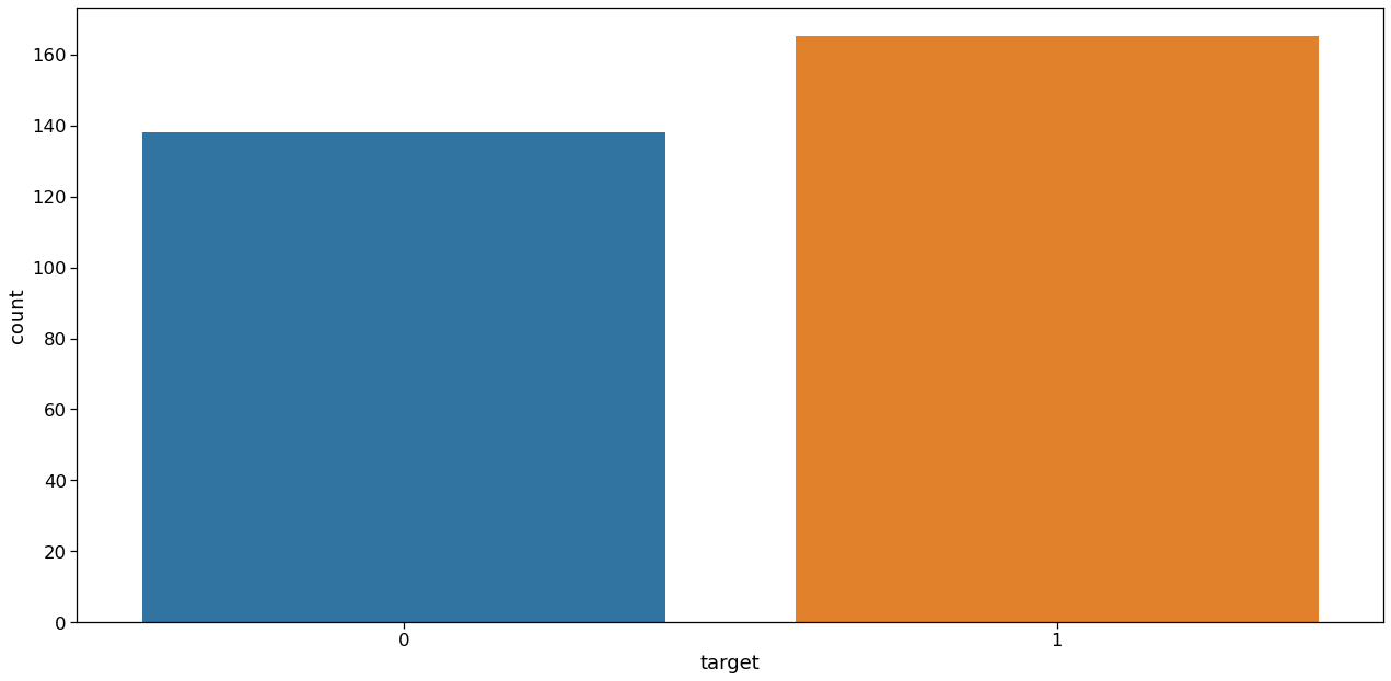
Inference: The ratio between 1 and 0 is much less than 1.5 which indicates that the target feature is not imbalanced. So for a balanced dataset, we can use accuracy_score as evaluation metrics for our model.
Feature Engineering
Now we will see the complete description of the continuous data as well as the categorical data
categorical_val = []
continous_val = []
for column in data.columns:
    print("--------------------")
    print(f"{column} : {data[column].unique()}")
    if len(data[column].unique()) <= 10:
        categorical_val.append(column)
    else:
        continous_val.append(column)
Output:

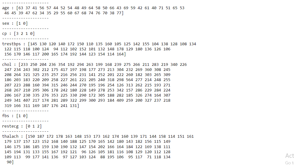
Now here first we will be removing the target column from our set of features then we will categorize all the categorical variables using the get dummies method which will create a separate column for each category suppose X variable contains 2 types of unique values then it will create 2 different columns for the X variable.
categorical_val.remove('target')
dfs = pd.get_dummies(data, columns = categorical_val)
dfs.head(6)
Output:

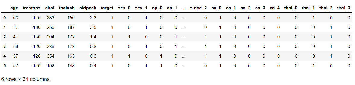
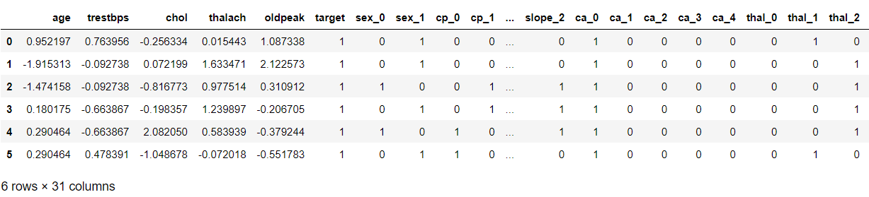
Now we will be using the standard scaler method to scale down the data so that it won’t raise the outliers also dataset which is scaled to general units leads to having better accuracy.
sc = StandardScaler()
col_to_scale = ['age', 'trestbps', 'chol', 'thalach', 'oldpeak']
dfs[col_to_scale] = sc.fit_transform(dfs[col_to_scale])
dfs.head(6)
Output:

Modeling
Splitting our Dataset
X = dfs.drop('target', axis=1)
y = dfs.target

X_train, X_test, y_train, y_test = train_test_split(X, y, test_size=0.3, random_state=42)
The KNN Machine Learning Algorithm
knn = KNeighborsClassifier(n_neighbors = 10)
knn.fit(X_train,y_train)
y_pred1 = knn.predict(X_test)
print(accuracy_score(y_test,y_pred1))
Output:
0.8571428571428571
Conclusion on Heart Disease Prediction
1. We did data visualization and data analysis of the target variable, age features, and whatnot along with its univariate analysis and bivariate analysis.
2. We also did a complete feature engineering part in this article which summons all the valid steps needed for further steps i.e.
model building.
3. From the above model accuracy, KNN is giving us the accuracy which is 89%.