





At my data science job, I’ve built my fair share of predictive algorithms and written complex SQL queries to analyze trends in data.
All of this analysis then needs to be translated into insights and explained to stakeholders, so they can decide on the business decision to make next.
The best way to break down complex information to a non-technical person is by creating visuals that are easy to digest. This can be in the form of standalone charts in a PowerPoint deck, a series of visualizations in your Jupyter Notebook, or an interactive dashboard on Tableau.
Data visualizations can also be created for your own understanding and interpretation of the data at hand. You can build charts to help you understand the relationship between different variables at just one glance.
In this article, I will teach you to perform data visualization in Python using the Seaborn library. By the end of this tutorial, you will be familiar with the following concepts:
- Techniques used to visualize numeric and categorical data
- The difference between univariate, bivariate, and multivariate analysis
- Creating regression charts and pair plots with Seaborn
- Visualizing the distribution of a variable.
Pre-requisites
To follow along to this tutorial, you need to have a Jupyter Notebook on your device. Do a simple ‘pip’ install of the Seaborn library if you don’t already have it.
Loading the Dataset
In this tutorial, we will be using a dataset built into the Seaborn library, so there is no need to download from an external data source.
import seaborn as sns
df = sns.load_dataset('tips')
df.head()
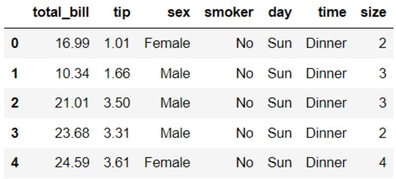
The dataframe above consists of 7 variables related to restaurant diners: The tips received in dollars, the bill in dollars, the sex of the bill payer, whether there were smokers in the group, the day, time, and size of the party.
With the aid of data visualization, we will attempt to uncover underlying patterns in the above dataset.
Univariate Analysis
Univariate analysis provides us with insight into one variable in the dataset, and allows us to explore and understand it better. It is the simplest form of statistical analysis.
In this tutorial, we will be looking into two types of charts to perform univariate analysis — histogram and count plot.
Histogram
First, let’s look into the distribution of the “total_bill” variable. This will give us an idea of the price range for a single meal at the restaurant.
sns.distplot(df['total_bill'],kde=False)
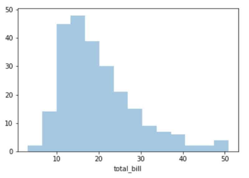
The chart above is a simple histogram of the “total_bill” variable. At a glance, we can see that a single meal at this restaurant generally costs around $10 to $25, and there is a positive skew due to some diners ordering more expensive food with prices above $50.
Count Plot
Now, let’s look at the number of male and female diners at the restaurant, to determine the gender that visits the eatery more often.
sns.countplot(x='sex',data=df)
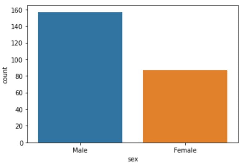
The restaurant has almost twice the number of male diners than female.
Let’s repeat this analysis to identify the busiest days of the week — days in which the restaurant has the highest number of transactions:
sns.countplot(x='day',data=df)
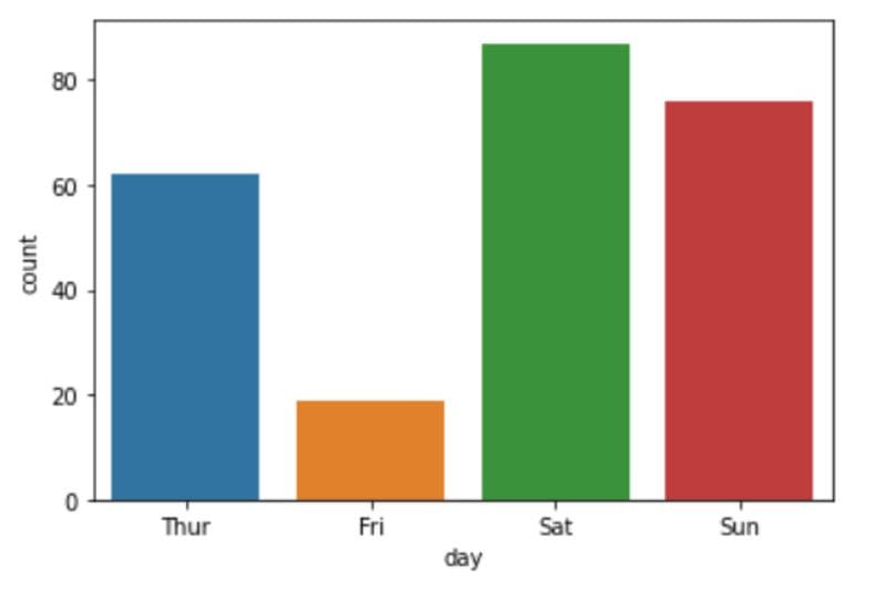
Of all the four recorded days, it appears that the restaurant has the highest number of patrons on Saturday, followed by Sunday. Friday, surprisingly, records the lowest number of transactions.
Bivariate Analysis
Bi-variate analysis involves finding relationships between two variables. To achieve this, we will create a bar chart, box plot, and regression plot.
Bar Chart
Now, let’s try visualizing the relationship between two variables — “sex” and “total_bill” to see if there is a difference in the amount spent by men and women when dining out.
sns.barplot(x='sex',y='total_bill',data=df)
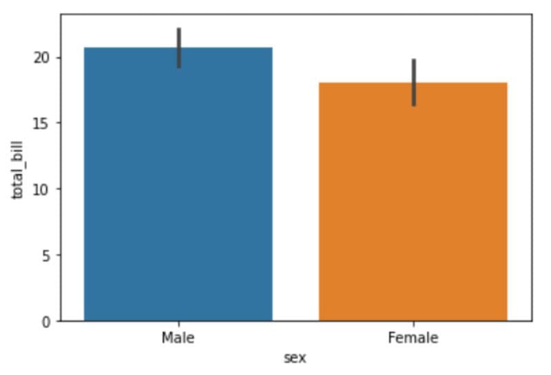
It appears as though men spend slightly more on a single bill at this restaurant than women, although the difference isn’t significant.
Box Plot
Let’s create a box plot to further understand the difference between the amount spent by male and female customers.
Box plots are a useful way to understand the spread of a variable, and provides us with a five number summary of the data point — minimum, first quartile, median, third quartile, maximum.
To create a box plot in Seaborn, run the following lines of code:
sns.boxplot(data=df, x='sex', y='total_bill')
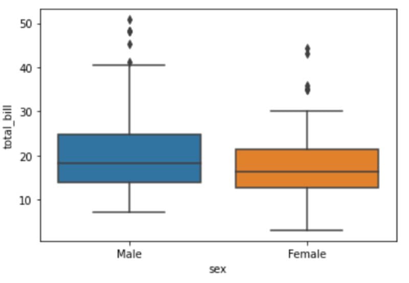
At a single glance, we can tell that the median amount spent by male and female diners is almost the same — approximately $15-$19. However, there is a huge difference in the minimum and maximum amounts spent.
There are female diners who have spent as low as $5 on a meal, and the maximum amount spent is around $30. This could be because women tend to eat less than men, or dine out in smaller groups.
Also, due to social convention, men are more likely to pay for food during dates or when out with a larger group of people, which might be why the most expensive bills are under their name.
Regression Plot
A regression plot is the best way to visualize the relationship between two numeric variables. Using Seaborn’s lmplot() function, a regression line is created to demonstrate the correlation between X and Y.
In this case, let’s look into the relationship between “total_bill” and “tip.” An initial assumption before creating the chart is that higher bill prices would mean an increase in the tips paid.
sns.lmplot(x='total_bill',y='tip',data=df)
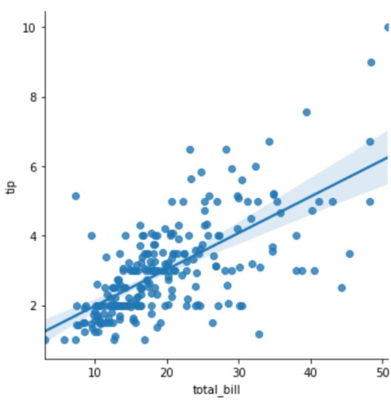
The chart above validates our assumptions. More expensive bills correlate with higher tips, and a positive linear relationship is observed between the two variables.
Multivariate Analysis
Finally, we will go through one example of multivariate analysis — the statistical analysis of many different variables at once.
sns.pairplot(df)

Creating a pairplot in Seaborn allows us to visualize the relationship between every numeric variable in the dataset at once.
The relationship of a variable with itself is displayed as a histogram, and its correlation to other variables is displayed as a scatterplot.
Seaborn’s pairplot() method is useful when analyzing a dataset that has multiple numeric features. In this case, for example, there are 3 numeric variables, and it is a lot easier to view their relationships in a single chart than having to create 9 separate visualizations.
Data Visualization with Python — Next Steps
In this tutorial, we went through the basics of data visualization with the Seaborn library. We learnt to create charts to help us perform univariate, bivariate, and multivariate analysis — all of which enables us to better understand the data at hand.
As you’ve seen in this article, data visualization isn’t difficult to implement and doesn’t require you to write a lot of complex code.
You just need to know the right kind of chart to create for different types of analysis. For example — regression plots to visualize two numeric variables, or bar plots for one numeric and one categorical variable.
Also, always make sure you start out with a question in mind before creating any kind of visualization. The purpose of a visualization is to tell you (or another person) something about the data that you don’t already know.
In a visualization we created above, for example, we set out to understand if men were spending more on food in the restaurant than women. Then, we decided that we’d look into the relationship between gender and total bill amount with the help of a bar chart.
This article is introductory, and just scratches the surface of what you can do with the Seaborn library. If you’d like to learn more about the different types of charts you can build with Seaborn (there are 14), then I suggest watching this hour long tutorial on YouTube.


