


Hello everyone! Do you realize it’s spring already? I’m almost ready to celebrate the holiday of flowers, but first: another data analysis practice for you today that will make your life easier (or at least more interesting, hopefully).
Do you ever receive questions like:
– Does correlation imply causation?
– How do you prove if features X and Y are correlated?
After this helpful guide, you will know the best way to answer those types of questions. In this article, I’ll focus on positive and negative correlation analysis and specifically cover:
1. Practical use cases for correlation analysis.
2. A methodology for how to build a correlation table and a heatmap in Python Pandas.
3. How to read and interpret different heatmaps and correlation charts.
4. How to prove that correlation implies causation.
When do you need to run a correlation analysis?
From a business perspective, correlation analysis helps you to answer questions like:
1. What is the relationship between 2 features on your product app?
2. Are they dependent or independent? Do they increase and decrease together (positive correlation)?
3. Does one of them increase when the other one decreases and vice versa (negative correlation)? Or are they not correlated?
4. Does changing a price affect subscription creation?
5. Does an increase in comments affect reshares?
There are multiple other analytical techniques that can help you tackle those or similar questions like hypothesis testing, decision trees, network analysis, matrix, or sorting. Correlation analysis is one of the more common ways to learn the relationship between 2 or more variables.
Correlation is represented as a value between -1 and +1 where +1 denotes the highest positive correlation, -1 denotes the highest negative correlation, and 0 denotes that there is no correlation. Below, I’ll demonstrate how to run correlation analysis using Python Pandas and read a heatmap.
How to build correlation analysis
Building a correlation chart in Python Pandas is very easy.
First, you have to prepare your data by having only numerical and boolean variables in columns (other formats will be ignored by the function). You don’t have to worry about missing/NULL values here, as the function excludes them. After that, you can simply run:
DataFrame.corr()
or
DataFrame.corr(method ='pearson')
This is for a DataFrame. You also can run Series.corr() to compute the correlation between 2 series.
DataFrame.corr() returns a correlation table between dataset variables. Here is an example of output from Reddit Exploratory Data Analysis in Python:

We see that both the score and number of comments are highly positively correlated with a correlation value of 0.63. There is some positive correlation of 0.2 between total awards received and score (0.2) and num_comments (0.1).
💡Note: this works for the Pearson correlation type, which is the most commonly used standard correlation. There are also Kendall and Spearman rank correlation types. You can specify the method of your correlation like this: DataFrame.corr(method =’kendall’). To learn the difference between these methods, I recommend reading this guide. But in a nutshell, we use Pearson to find a linear relationship between normally distributed variables. When the variables are not normally distributed or the relationship between the variables is not linear, we would use the Spearman rank correlation method.
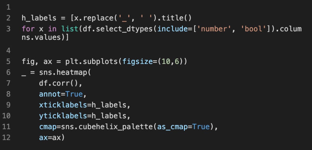
Now let’s visualize the correlation table above using a heatmap:
How to read correlation charts:
Each square shows the correlation relationship between the variables on each axis. As I said above, correlation ranges from -1 to +1.
– Values closer to 0 mean that there is no linear trend between 2 variables.
– The close to 1 the correlation is the more positively correlated they are, the stronger this relationship is.
– A correlation closer to -1 is similar, but instead of both increasing like the example above, one variable will decrease as the other one increases.
– The diagonals are all 1 and marked dark because those squares are correlating each variable to itself (so it’s a perfect correlation, therefore it is 1).
Overall, the larger the number and the darker the color, the higher the correlation between 2 variables. The plot is also symmetrical and diagonal because the same 2 variables are being paired together in those squares.
Another example from my EDA analysis – Predicting Titanic Survival. This plot is meant to show if there is a relationship between such variables as having children, parents, siblings, expensive tickets (fare), or specific age, all compared to passenger survival on the Titanic. It might be a grim example, but it’s a good one:
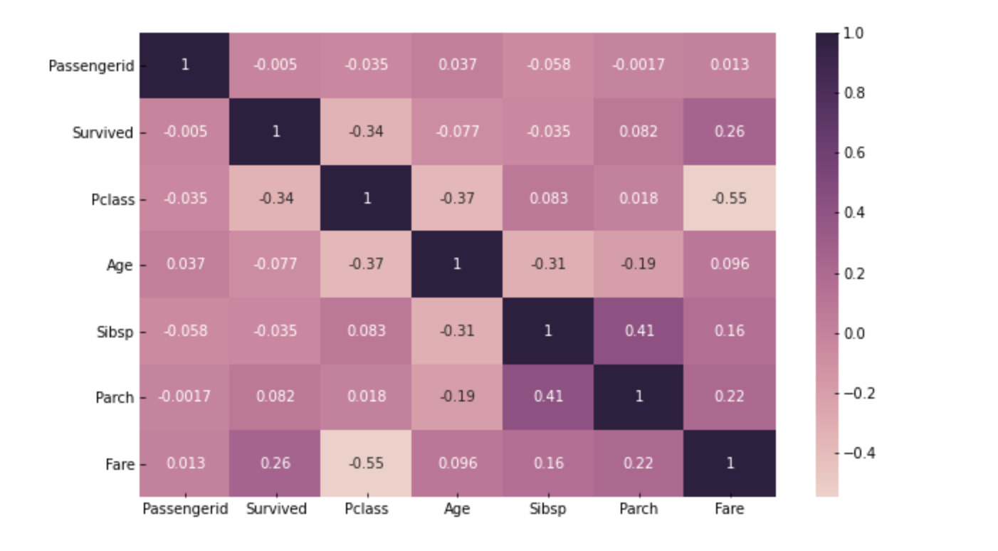
As you noticed, there are no high correlations in this graph. The highest value is 0.4 between parents/children and siblings. This relationship analysis guides us to the right input variables to create a ML model to predict passenger survival.
How to prove correlation implies causation?In addition to the correlation table and a heatmap, for some of the business cases you should consider other factors based on historical data, events, user attributes, and business case specifics:
Strength – a relationship is more likely to be causal if the correlation coefficient is large and statistically significant. This is directly related to the correlation table output data.Consistency – a relationship is more likely to be causal if it can be replicated.
Temporality – a relationship is more likely to be causal if the effect always occurs after the cause.Gradient – a relationship is more likely to be causal if greater exposure to the suspected cause leads to a greater effect. This is related to positive or negative correlation. As I stated above, negative correlation occurs when one variable decreases as the other one increases.
Experiment – a relationship is more likely to be causal if it can be verified experimentally. You can run hypothesis testing to prove it.
Analogy – a relationship is more likely to be causal if there are proven relationships between similar causes and effects.


